
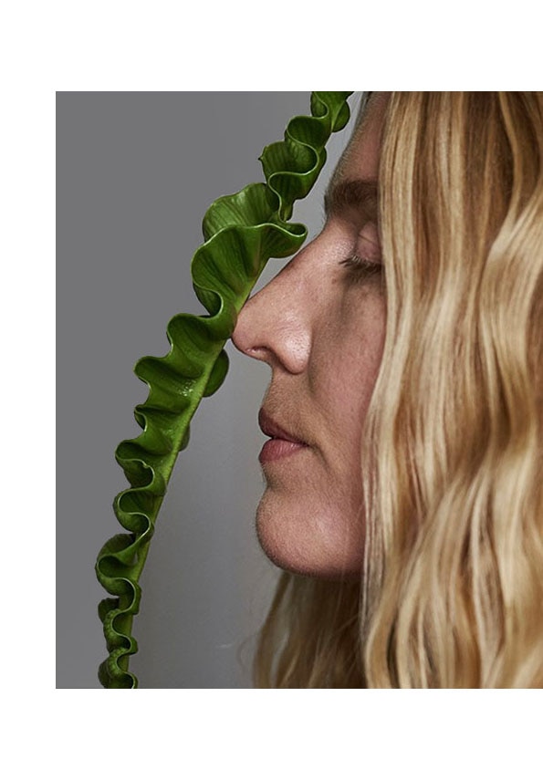
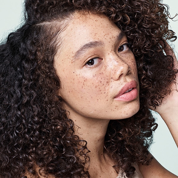
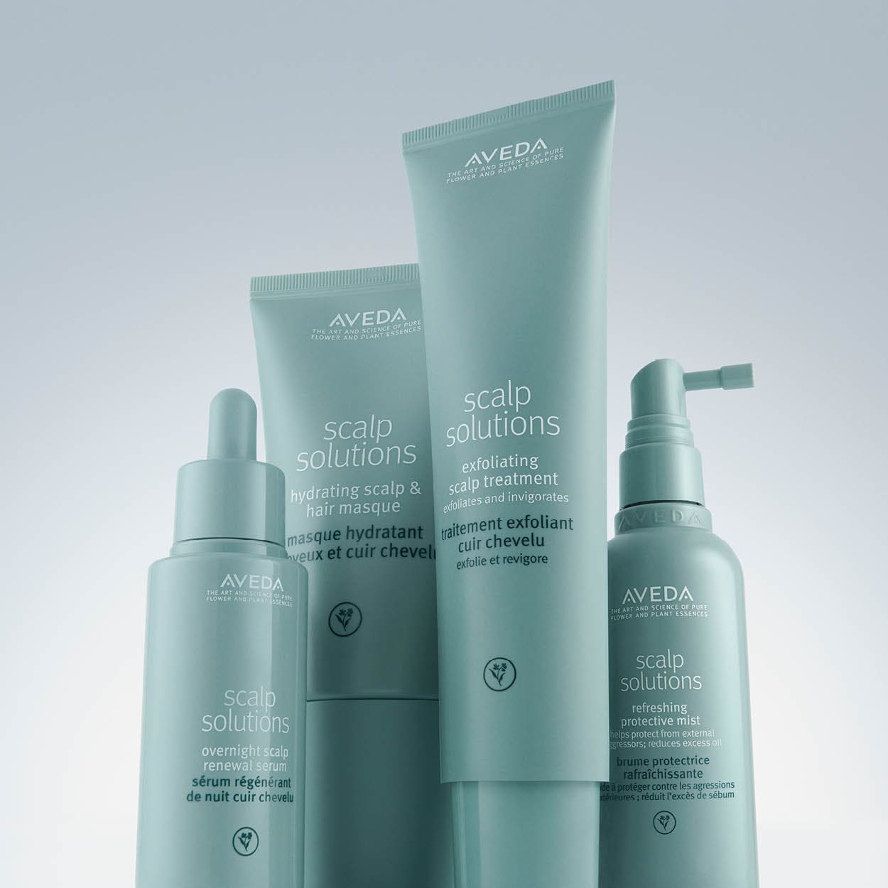
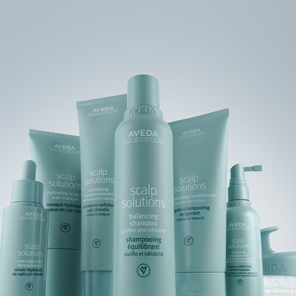
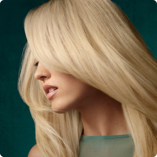
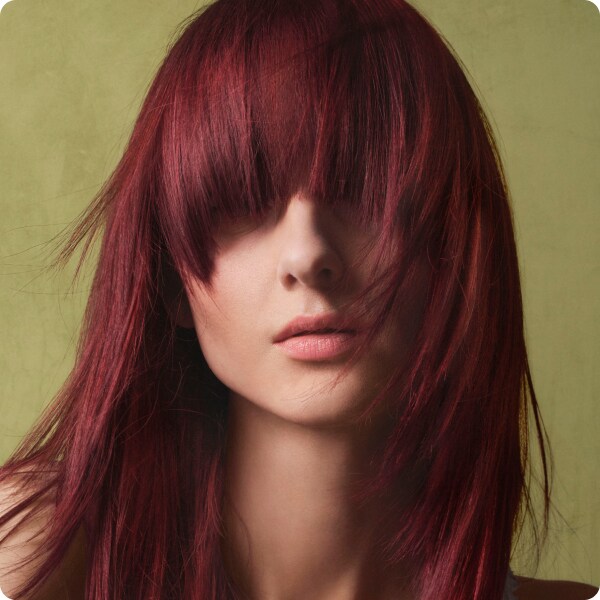
NEW
scalp solutions
Backed by research from world-leading authorities in the science of scalp biology.
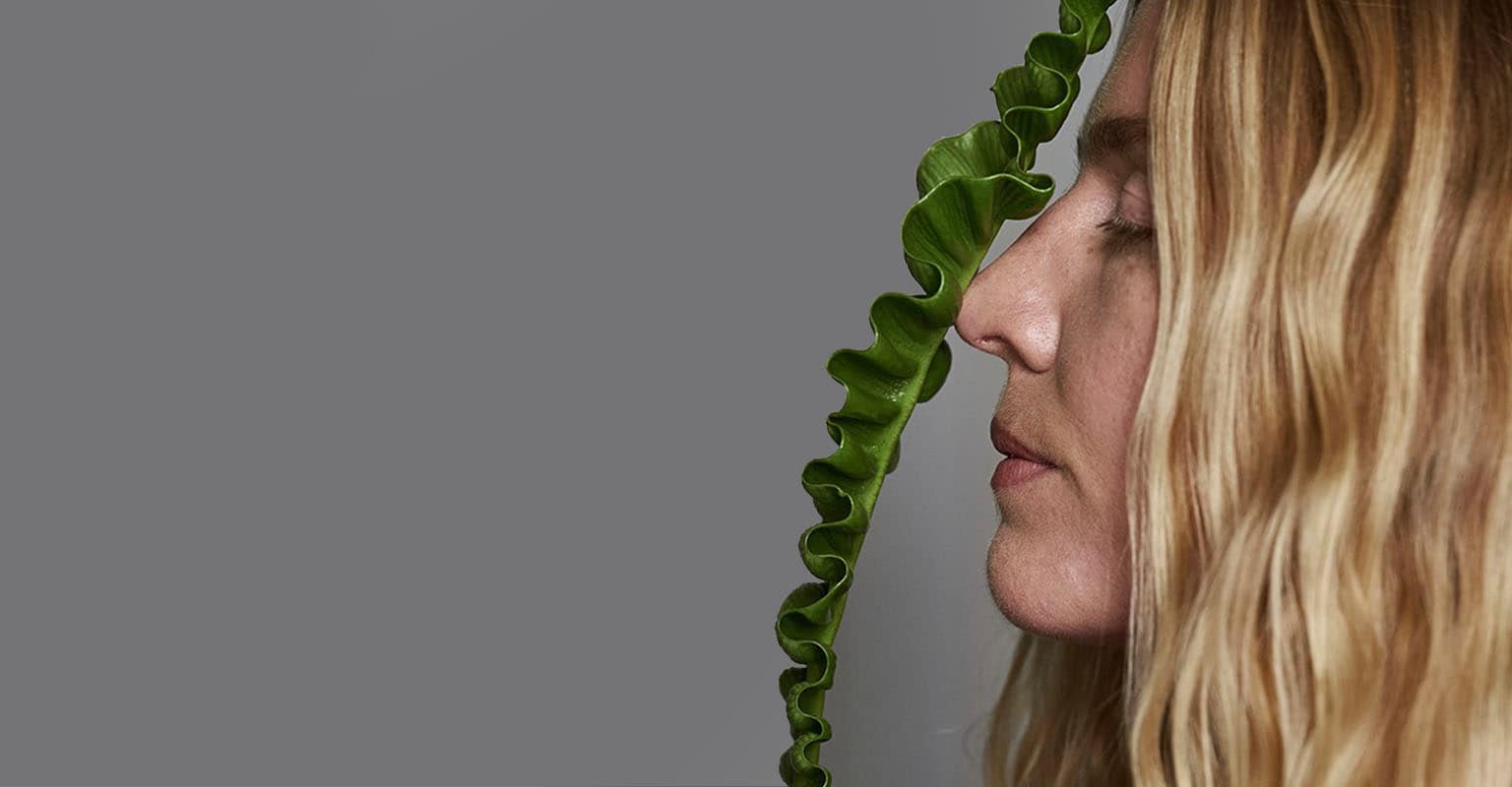
NEW
scalp solutions
Backed by research from world-leading authorities in the science of scalp biology.
Description:
This content block is used to add an image or a GIF. The entire block can be made clickable using the Module URL.
There are 6 text rows available, which can be used for each sentence or paragraph as needed. Additionally, there’s a separate disclaimer section that’s independent from the text rows.
Text can be aligned and positioned to the left, right, or center — both horizontally and vertically.
Buttons move along with the text, and their colors and styles can be customized. You can use default styles or personalize the background, border, and text color.
The entire block can also be configured separately for desktop and mobile using extra styles, which allow you to adjust spacing when you need more or less space between other content blocks.
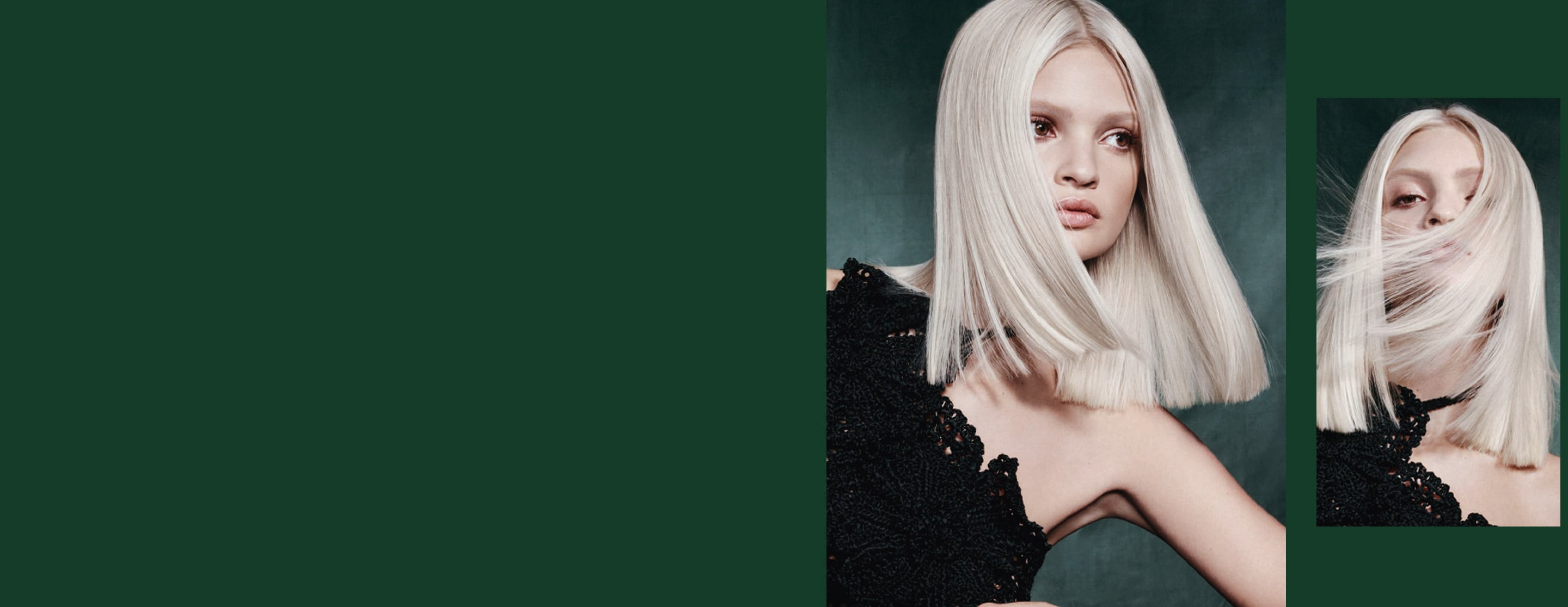
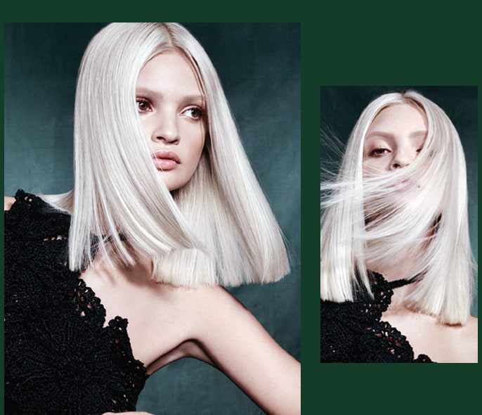
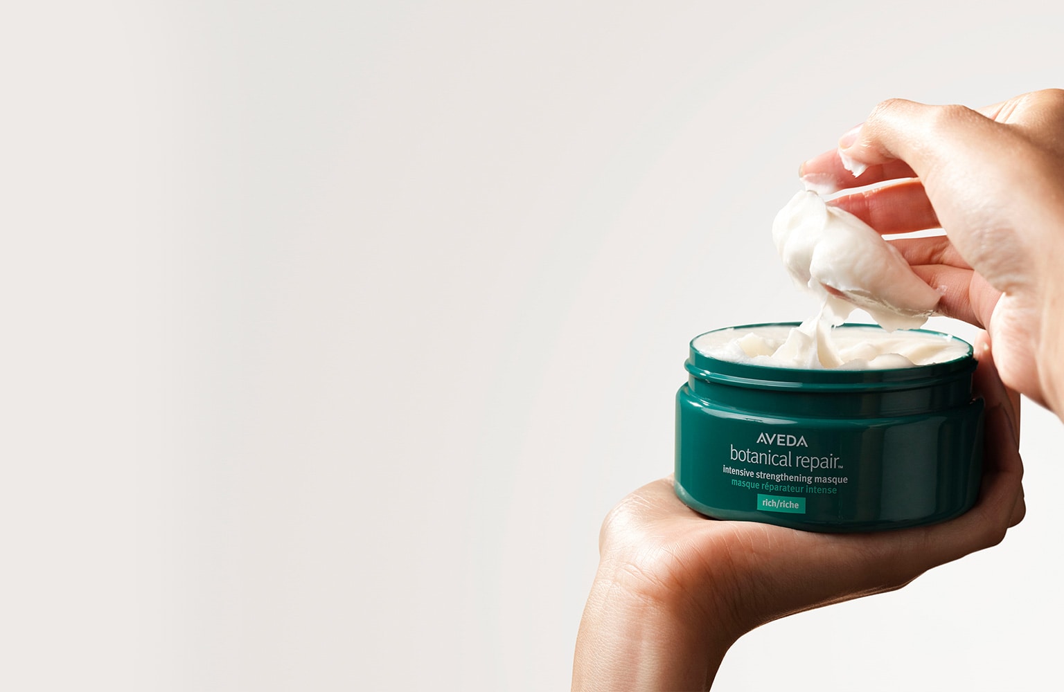
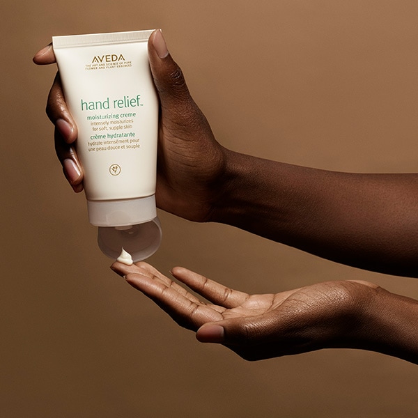
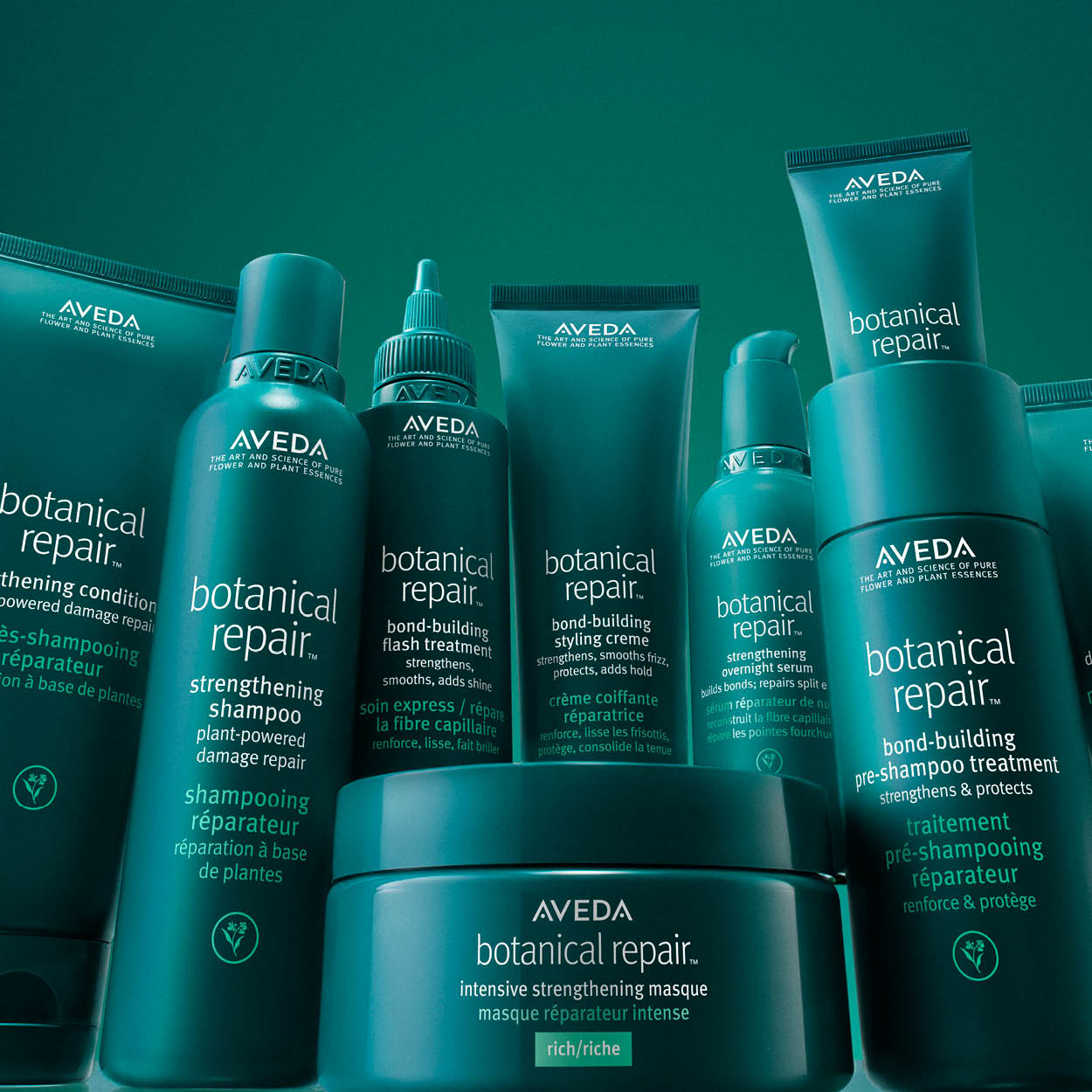
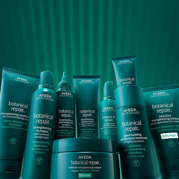
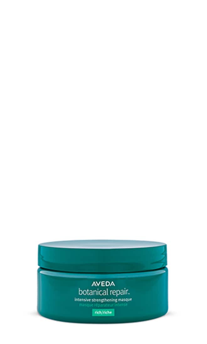
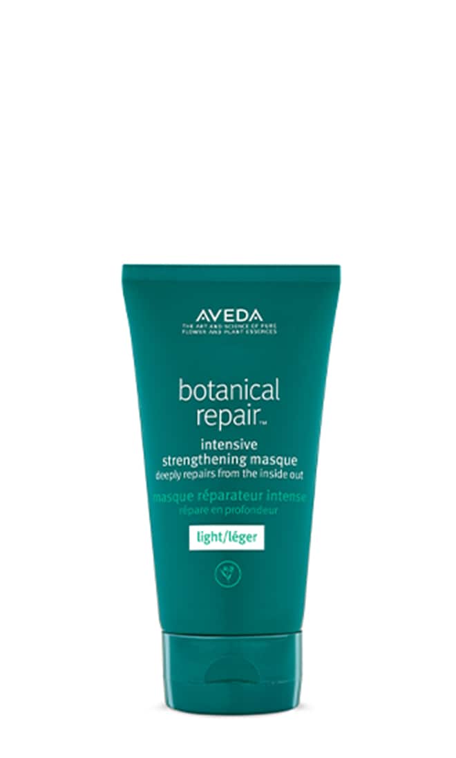
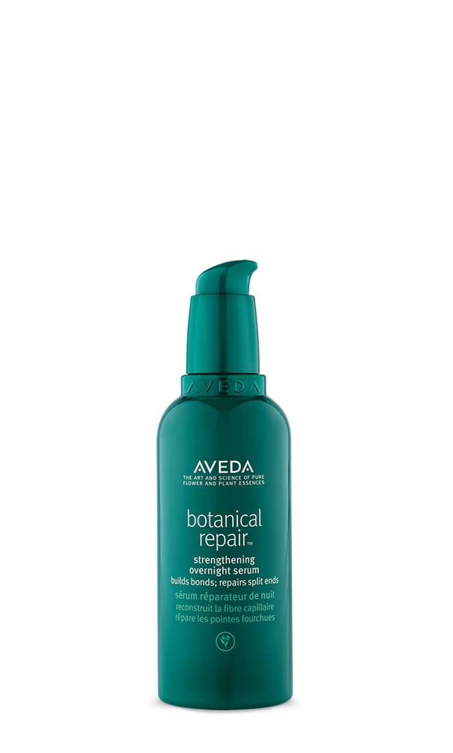
Botanical Repair™ Bond-Building Hair Care 25% off
Repair rooted
in nature
Builds new bonds and helps protect against future damage with the power of plants.
Botanical Repair™Bond-Building Hair Care 25% off
Repair rooted in nature
Builds new bonds and helps protect against future
damage with the power of plants.
Description:
If you want to add an MP4, you will need to use this template. The MP4 should be uploaded in the fields labeled “Desktop MP4” and “Mobile MP4.” Make sure to check the box that says “Preload the image?”
The features for text, buttons, and extra margin styles are the same as in the previous content block.
Description:
With this template, you can use two large full-width content blocks that have the same features previously mentioned, such as customizable text and buttons.
Text and buttons can be aligned and positioned to the left, right, or center — both horizontally and vertically.
After configuring your content blocks, you’ll need to add a “formatter template” at the end and select "CONTENT BLOCK LARGE - FORMATTER - v1."
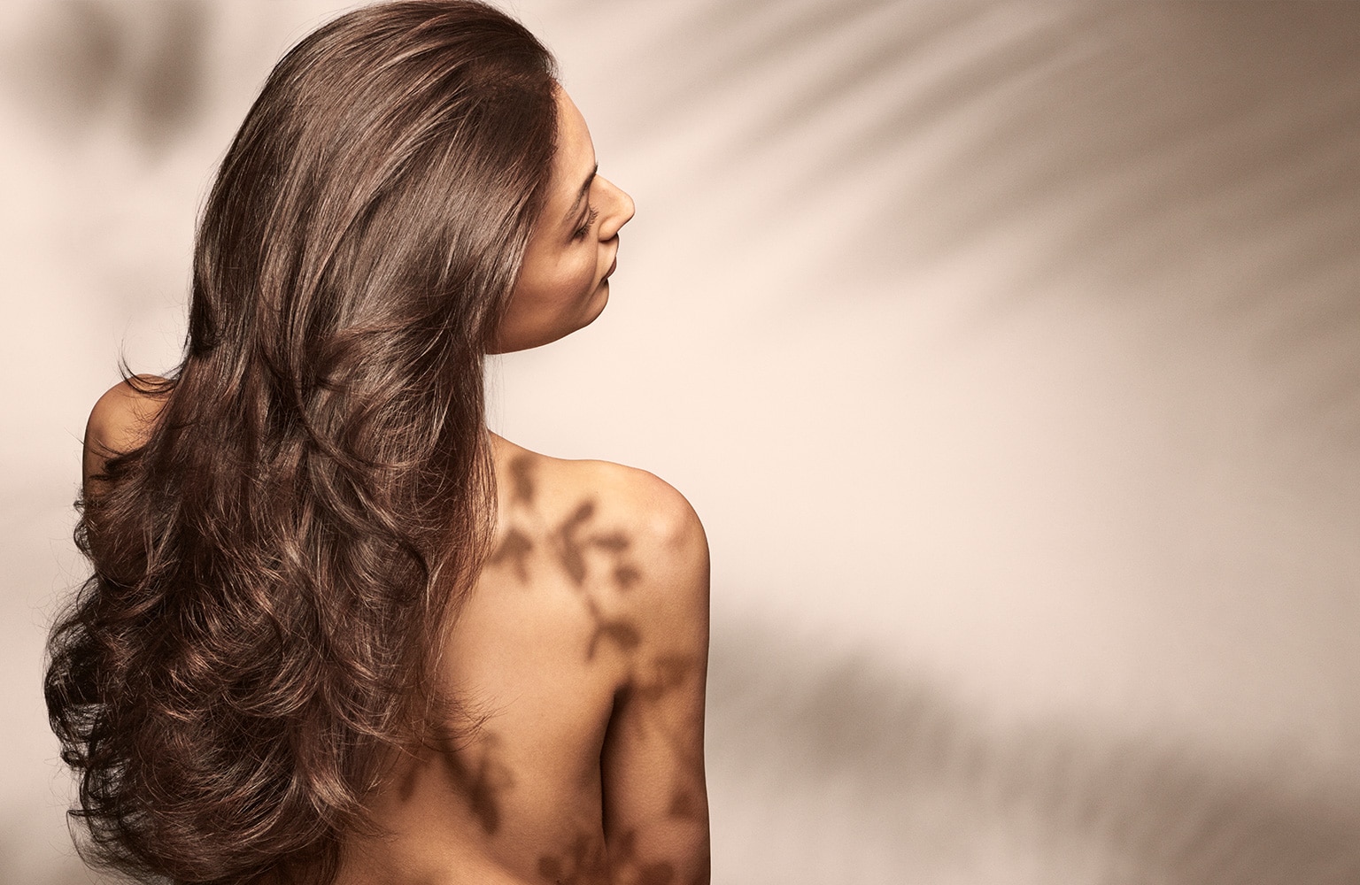
Ingredient Selection /
Ingredient Philosophy
It’s what’s inside that counts. That’s why we
work tirelessly to formulate and bring you
the best products possible.
Ingredient Selection / Ingredient Philosophy
It’s what’s inside that counts. That’s why we work tirelessly to formulate and bring you the best products possible.
Description:
This is a Content Block Split Width, designed to use a single image with separate text. The entire block can be made clickable by using the Module URL.
The image can be aligned to either the left or the right.
To adjust the alignment and positioning of the text, you can use HTML or the built-in template settings, which are the same as those in the large full-width content block.
Description:
This is a "Tout Basic: Basic Grid Formatter." It is designed to display 3 to 4 small images or videos that fit well within a grid layout. You can use the same image for both desktop and mobile, and the content type should be “Tout - Basic - v1.” The entire tout can be made clickable. Images can be aligned to the top, bottom, left, or right.
There’s a section to add text and a button, which will automatically be centered within the tout.
After configuring your touts, you’ll need to add a “formatter template” at the end and select “Basic Grid Formatter - v1.”
You’ll also need to choose the number of columns for desktop and mobile, and adjust the padding between each tout as needed.
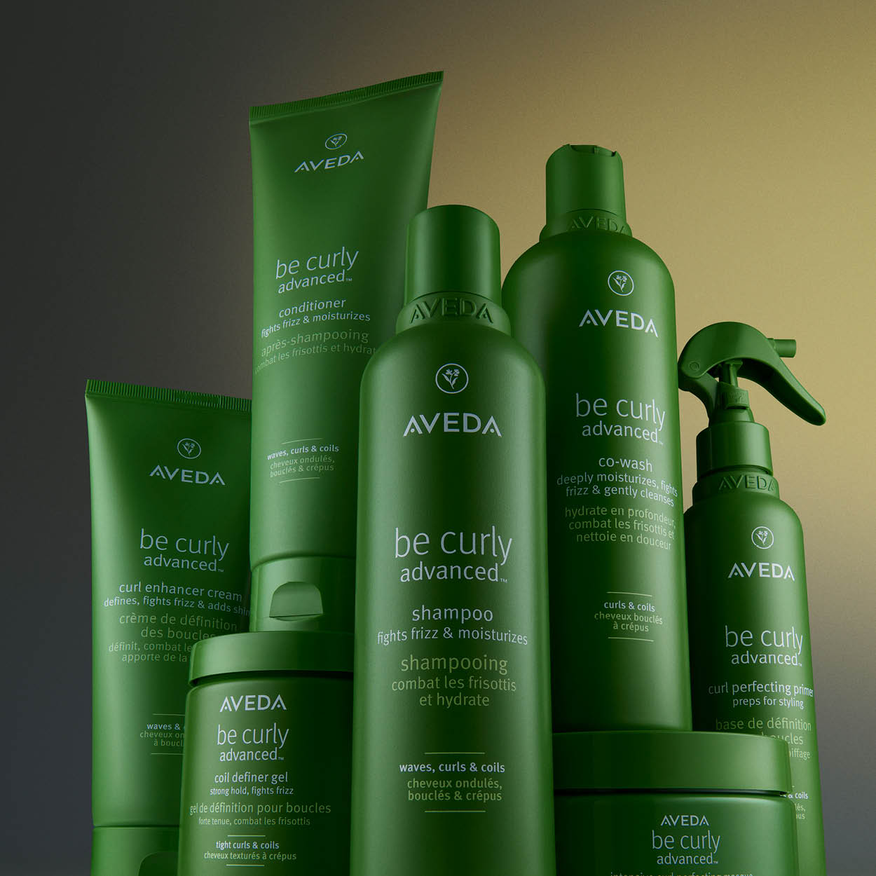
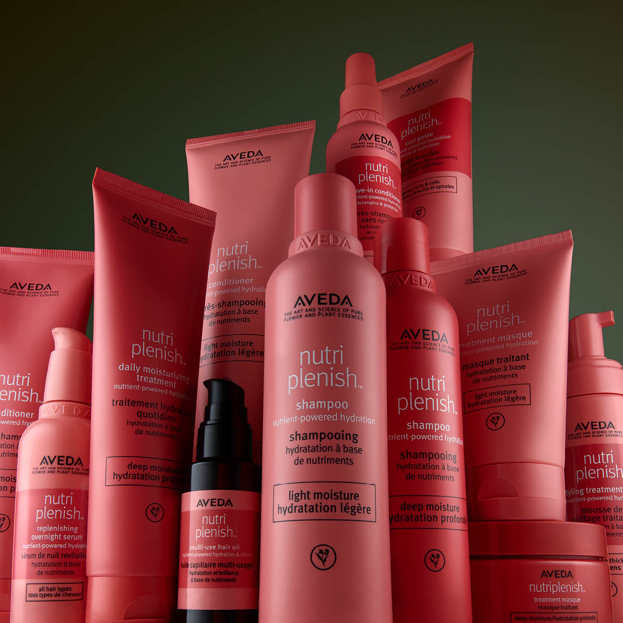
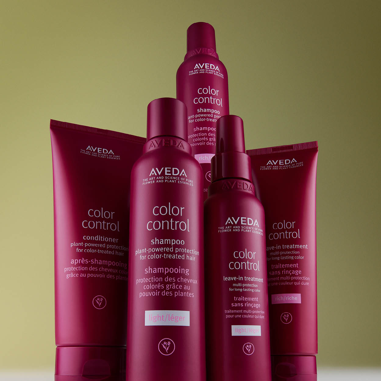
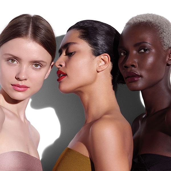
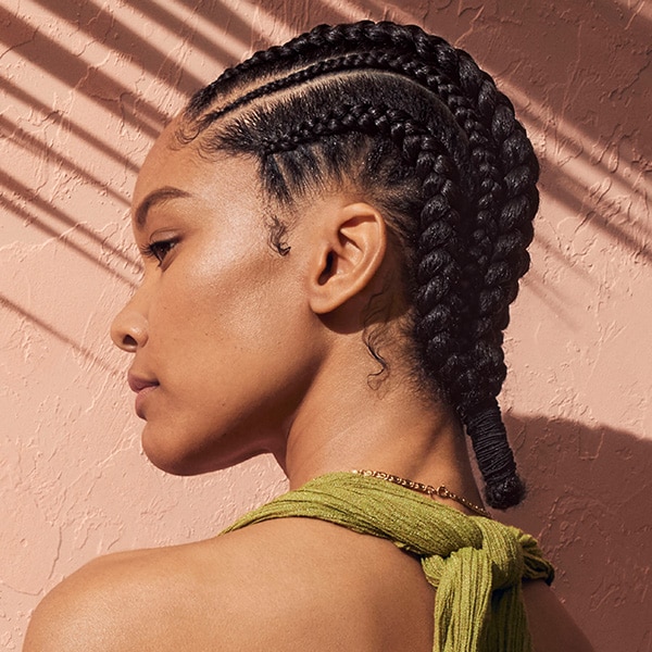
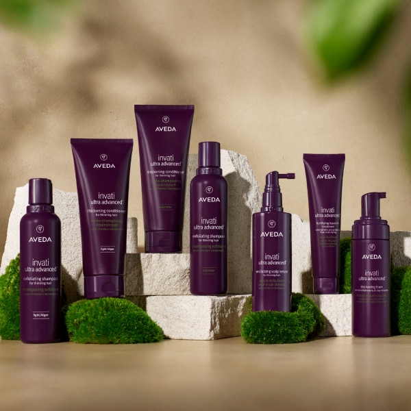
Best for your unique hair type
100% vegan products designed to enhance your hair's natural beauty.
Description:
The “Tout Basic: Basic Carousel Formatter” works differently from the previous one.
To set it up, you first need to create two separate "Tout Basic: Basic Grid Formatter blocks." In each one, use three “Tout - Basic - v1” entries, each with its corresponding image, text, or button. Select the “Basic Grid Formatter - v1” as the formatter template and save them.
Once you’ve created both "Tout Basic: Basic Grid Formatter" blocks, you’ll then create a new content block and reference the two grid formatters using (Basic Block Node Reference - v1.)
Finally, select the “Basic Carousel Formatter - v1” as the formatter template, and configure the “Slides To Show and Scroll - wide display” settings as needed.
*Aveda U.S. is funding emission reduction projects of offset CO2e emissions as a result of deliveries made from our Aveda U.S. fulfillment center to our customers' delivery addresses (excludes buy online and pickup in store, and same-day delivery).
*Aveda U.S. is funding emission reduction projects of offset CO2e emissions as a result of deliveries made from our Aveda U.S. fulfillment center to our customers' delivery addresses (excludes buy online and pickup in store, and same-day delivery).
Description:
Living Aveda - Custom Text - v1 is a text format that allows you to easily configure the Large Screen Text Container Percentage Width, as well as the alignment and font size. It’s typically used for disclaimers and is referenced directly within pages.
Description:
Living Aveda - Custom Text - v1 is a text format that allows you to easily configure the Large Screen Text Container Percentage Width, as well as the alignment and font size. It’s typically used for disclaimers and is referenced directly within pages.
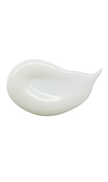
HAIR SERUM
HAIR SERUM
Description:
Tout - Landscape Style - v1 is typically used for headers on PLP or PDP pages. For best results, the "Header Text Size" should be set to "Large."
Description:
Tout - Landscape Style - v1 is typically used for headers on PLP or PDP pages. For best results, the "Header Text Size" should be set to "Large."
Discover botanical repair™
Discover botanical repair™
Description:
This section is divided into two parts (in this example, the title is not referenced—it is added directly within the page node).
First, we use Tout - Landscape Style - v1 for the title. Then, we add MPP - Custom Product Layout - v1, which is used to display the selected products. You can choose to show them in columns or as a carousel, for both desktop and mobile.
Additionally, you can insert promotional or informational touts to appear in between the products. You have full control over their position and how much space they occupy.
These touts should be created separately using Tout - Portrait Style for MPP - v1.
Frequently Asked Questions
Frequently Asked Questions
Description:
For FAQs, there are specific templates available—use "FAQ - v1." Here, you can add each question along with its corresponding description.
For each FAQ item, make sure to configure the Plus button, Minus button, Plus icon title, and Minus icon title.
Once your FAQ entries are set up, you’ll need to add a formatter template called "FAQ Formatter" to display them in an accordion style.
Be sure to check the option "Display accordion open on default?" if you want the answers to be expanded by default.
scalp solutions
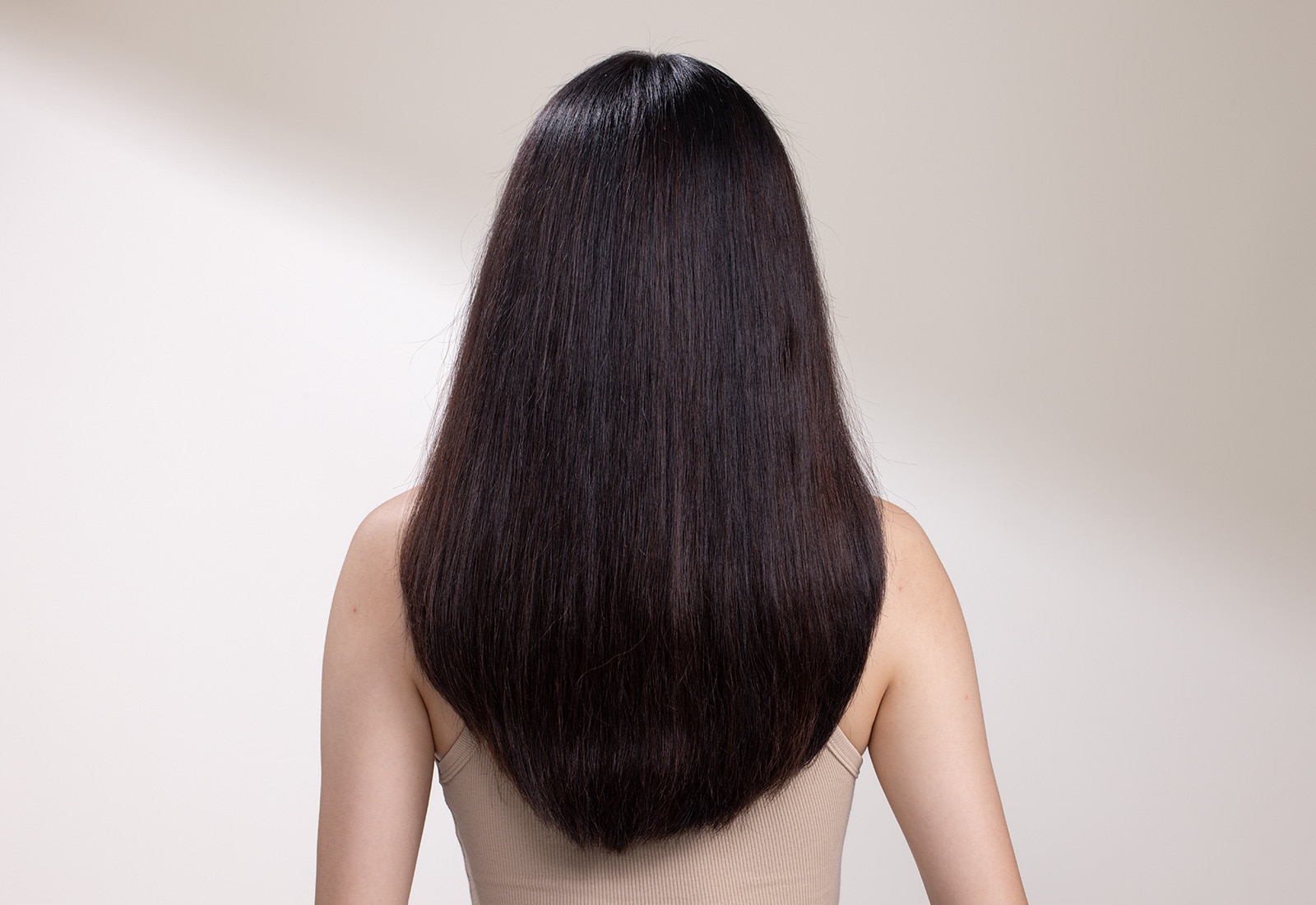
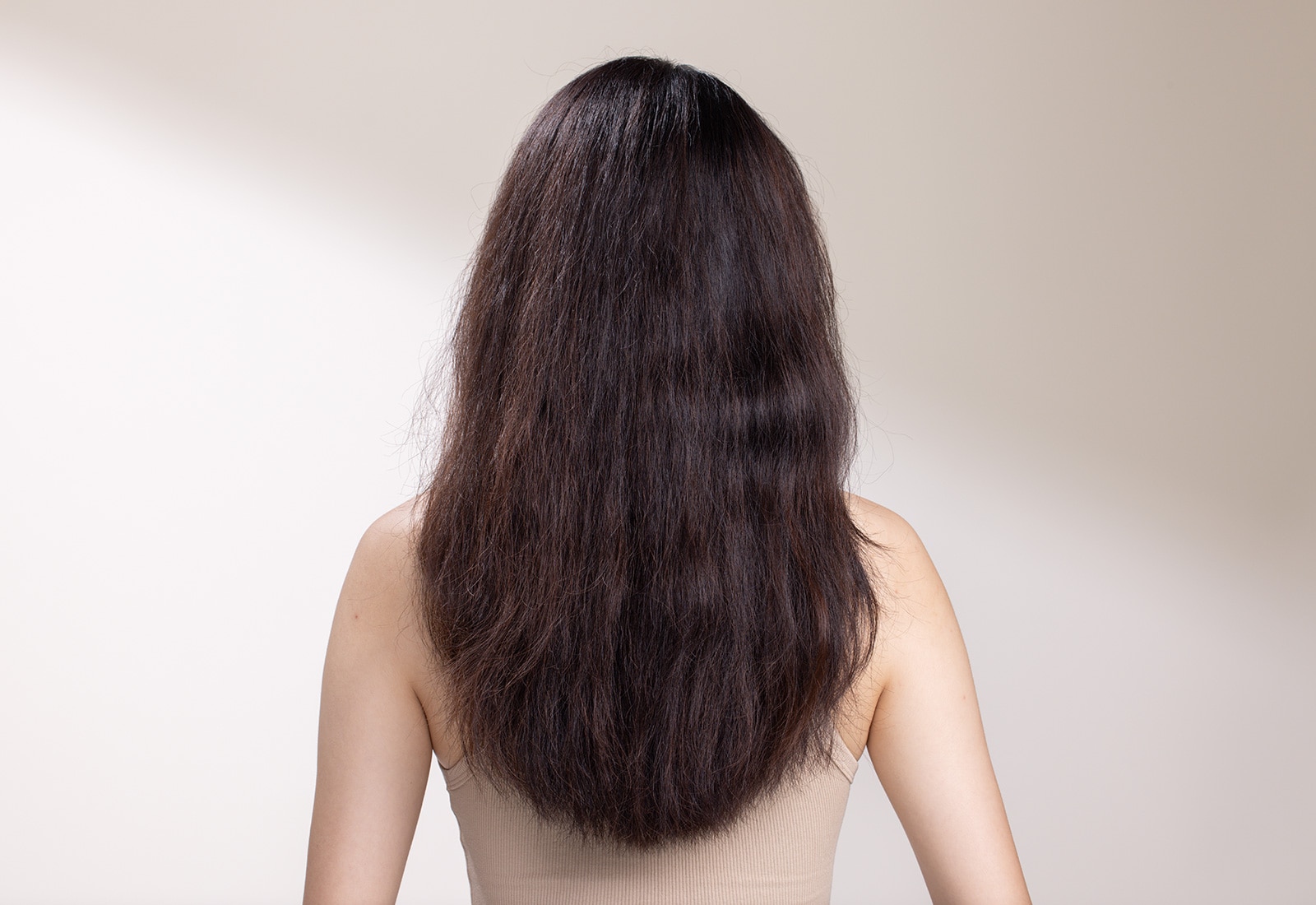
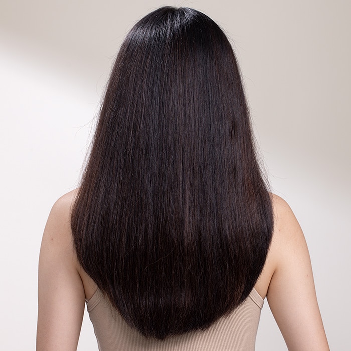
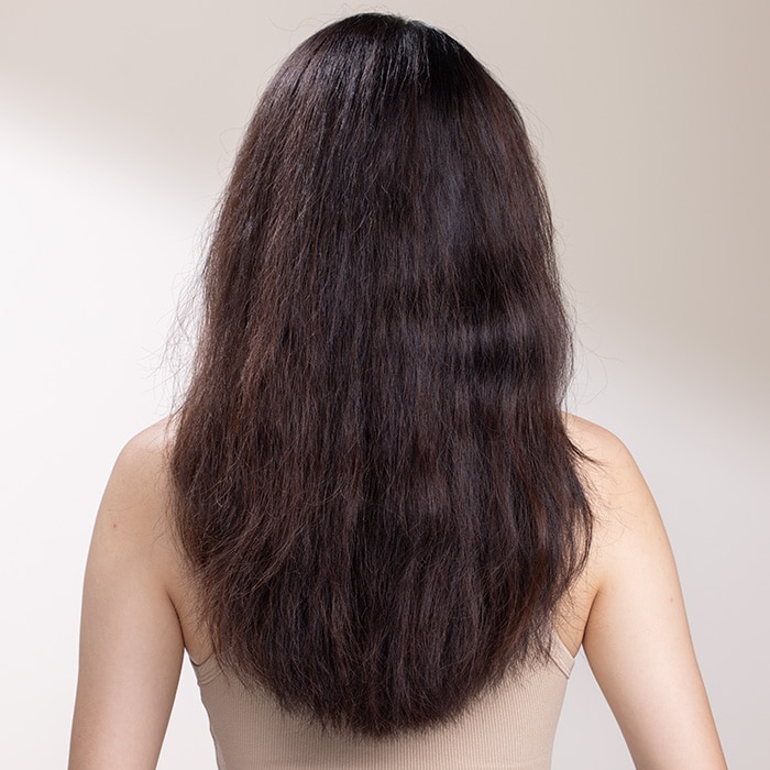
Before: Unwashed hair.
After: Results with scalp solutions overnight serum, massager, exfoliating treatment, shampoo, conditioner and mist. Blow dried with round bristle hairbrush, stylied with curling iron.
Before: Unwashed hair.
After: Results with scalp solutions overnight serum, massager, exfoliating treatment, shampoo, conditioner and mist. Blow dried with round bristle hairbrush, stylied with curling iron.
Description:
In the Content Block Slide Comparison - v1, two images are used to visually showcase a comparison. Each image can have a title, and the image size is fixed by default.
You’ll need to configure the "Starting Position" and the "First Full Swipe Direction" to determine how the comparison slider behaves initially.
If you'd like to add a description below the images, you should include a "Tout - Landscape Style - v1" separately.
#BotanicalRepair
Has your hair been transformed?
Share your pics with the world, and you could appear right here!
Simply tag yours with #BotanicalRepair and mention @aveda for a chance to be featured.
#BotanicalRepair
Has your hair been transformed?
Share your pics with the world, and you could appear right here!
Simply tag yours with #BotanicalRepair and mention @aveda for a chance to be featured.
Description:
To display a YouTube video without navigating away from the current page (using a Play Button), you can use the Video Block - Large - Full Width - v1. This template is similar to the Content Block Large Full Width in terms of how you configure the text and button.
In the V"ideo Options", make sure to select "YouTube" and enter the YouTube ID —this is the part of the URL that comes after (watch?v=)
Community story.
The trip to collect water is slippery
and far for Gisèle and her mother.
With clean water nearby, they'll have
more time and fewer worries. Hear
from Gisèle why clean water changes
everything.
Community story.
The trip to collect water is slippery
and far for Gisèle and her mother.
With clean water nearby, they'll have
more time and fewer worries. Hear
from Gisèle why clean water changes
everything.
Description:
To display a YouTube video without navigating away from the current page (using a CTA), you can use the Video Block - Large - Full Width - v1. This template is similar to the Content Block Large Full Width in terms of how you configure the text and button.
In the "Video Options", make sure to select "YouTube" and enter the YouTube ID —this is the part of the URL that comes after (watch?v=)
Cool curls & coils
Let the Glam Twinz be your guide to lusciously nourished hair with their personal style guide. Watch and learn!
Let the Glam Twinz be your guide to lusciously nourished hair with their personal style guide. Watch and learn!
Description:
Video Block - Large - Split Width - v1 works the same way as the previous one, with the main difference being that it uses a single image so the text can be positioned to one side.
Description:
Video Block - Large - Split Width - v1 works the same way as the previous one, with the main difference being that it uses a single image so the text can be positioned to one side.
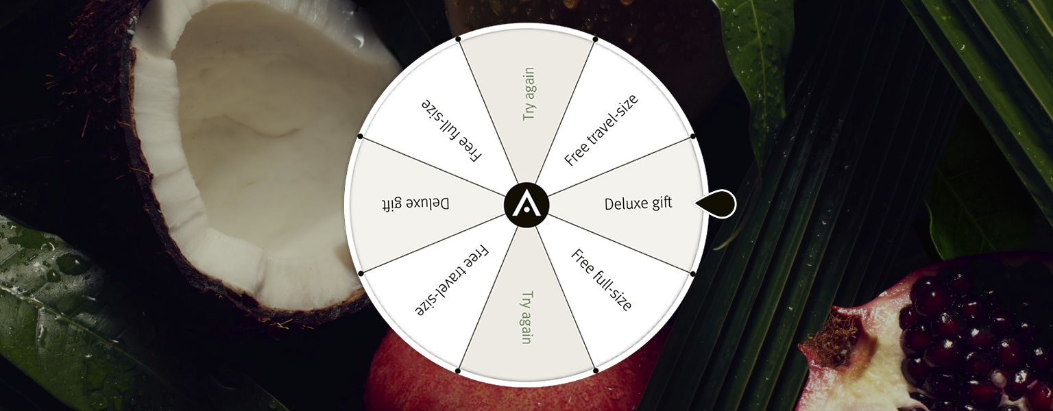
Spin to Win
Play for a chance to win a travel-size, full-size or deluxe gift with your purchase.*
Spin to Win
Play for a chance to win a travel-size, full-size or deluxe gift with your purchase*
Description:
Here, we use the Content Block - Large - Full Width - v1, which is configured in the same way as the other examples.
Description:
Here, we use the Content Block - Large - Full Width - v1, which is configured in the same way as the other examples.
Description:
For the TikTok Video Module, you should use four Tout - Basic - v1 blocks. Here, you add an image as the cover and the video itself. Once you’ve configured it to your liking, apply the "Basic Grid Formatter - v1" as the formatter template. Then, adjust the number of columns, padding, and other settings as needed.

Description:
For the Carousel Module for "Menu", we use a “Tout Basic: Basic Carousel Formatter.” First, create 2 separate Tout Basic: Basic Grid Formatter blocks. In one, use 3 “Tout - Basic - v1” blocks with their respective images, text, or buttons. Select the formatter template as “Basic Grid Formatter - v1” and save them.
Once you have both Tout Basic: Basic Grid Formatter blocks, create another content block and reference them using “Basic Block Node Reference - v1.”
Next, choose the formatter template as “Basic Carousel Formatter - v1” and configure the “Slides To Show and Scroll - wide display.” In this case, set it to 2, so both will be displayed in a single view.